July 24, 2026

The brief usually arrives in one line. We need a logo for the building.
By then the land is bought, the architect is appointed, the renders are half finished, and the name was chosen in a meeting six months ago because it was the street it sits on.
So the logo gets asked to do a job nobody defined.
A logo separates your project from every other project competing for the same buyer. That is the first job. Everything else it does comes after that one.
The second job is structural. The logo is the cornerstone the rest of the system is built on: the typography, the grid, the colour, the signage, the paper. Get it right and every piece that follows has something to hold onto. Get it wrong and every piece that follows is doing repair work
The third job is the one most people forget. It carries a decision. When Uncommon rebranded JD Sports, they set the mark at a ten degree angle to signal forward momentum, then ran that idea through the typeface and the motion across 38 markets. The angle is not decoration. It is a strategic position made visible.
Your logo is the same. It either carries a decision about who this building is for, or it carries nothing.
Your mark goes on a building.
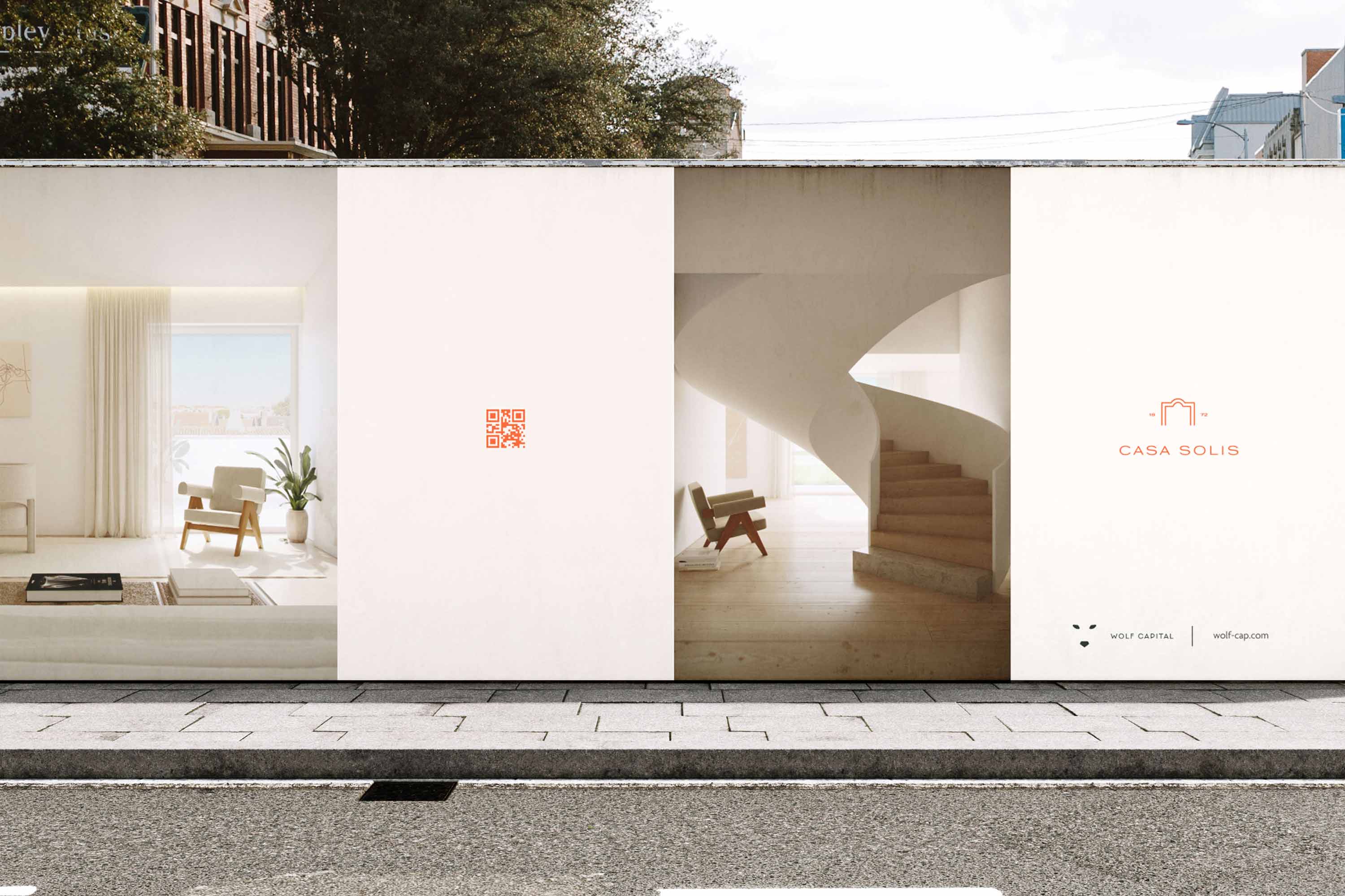
That changes the craft entirely. Most logos live on a screen and a business card. Yours lives in brass on a façade, cut into stone at the entrance, on a hoarding at construction scale, embossed on a folder handed across a table, and at forty pixels in a browser tab.
So we design for the hardest condition first, not the easiest. That means it works in one colour before it works in five. It survives being cast, cut, and debossed. It reads at fifty metres and at two centimetres. It looks right next to the architecture rather than fighting it.
And it holds for a decade. A development is not a campaign you refresh next season. The mark on that façade will still be there when the second owner sells to the third.
That rules out most of what the category produces. The roofline. The key. The abstract swoosh that suggests a window. Those marks are interchangeable, which means they perform the opposite of the first job.
The name comes before all of this, and it decides how hard the logo has to work. Aman, Soneva, Lanserhof: none of them explain what they are. They are spatial rather than descriptive, and short names create clean grids that look stable on a façade. A long descriptive name forces the mark to compensate for the rest of its life.
Some developers run one identity system across everything they build. Real Estate Development company MEXTO does this well. They have been developing in Lisbon since 2017, with a project volume in the hundreds of millions and a shelf of national awards, and their projects sit inside one consistent visual language, largely named after the streets they occupy.
I have nothing against it. I like their branding and I like the logos for their properties.
The case for that approach is real, and worth stating honestly. Trust transfers. A buyer who bought well from you once recognises the next project immediately. Investors read consistency as stability. The developer's own reputation becomes an asset that every new building inherits on day one, which matters enormously when you are selling from a render before anything exists.
If your buyer is the same buyer every time, that system is sound.
Every building is different, so I believe the branding should express that difference.
A nineteenth century rehabilitation in Graça and a new-build on the coast are not the same product. Different era, different street, different light, different materials, different life. The buyer for one is not the buyer for the other. One person is buying a historic address in the city. Another is buying the water and the view.
A single mark cannot say both of those things with conviction. It can only say the developer's name, and then let the building explain itself. That is a lot of weight to leave on the architecture alone.
So when a developer asks for my recommendation, I recommend a distinct brand for each project. The identity comes out of that specific building: what it is, where it stands, and who is going to live in it.
There is a version that takes both. The project carries its own name and identity and leads the communication, and the developer signs it, the way a producer signs a film. The buyer falls for the building. The signature tells them who stands behind it.
That is usually the answer for a developer with a real track record and a genuinely varied portfolio.
Print it at signage scale and hold it against a photograph of the actual façade. Look at it in one colour. Look at it small. Ask who it is speaking to, and be specific about that person.
If the answer is a real buyer with a real life, the mark is doing its job. If the answer is "premium buyers," you are looking at a decoration.
We build visual infrastructure for premium physical spaces. Based in Lisbon. Creating worldwide.
Send us a DM to start a collaboration.
Some developers run one identity system across everything they build. Real Estate Development company MEXTO does this well. They have been developing in Lisbon since 2017, with a project volume in the hundreds of millions and a shelf of national awards, and their projects sit inside one consistent visual language, largely named after the streets they occupy.
I have nothing against it. I like their branding and I like the logos for their properties.
The case for that approach is real, and worth stating honestly. Trust transfers. A buyer who bought well from you once recognises the next project immediately. Investors read consistency as stability. The developer's own reputation becomes an asset that every new building inherits on day one, which matters enormously when you are selling from a render before anything exists.
If your buyer is the same buyer every time, that system is sound.
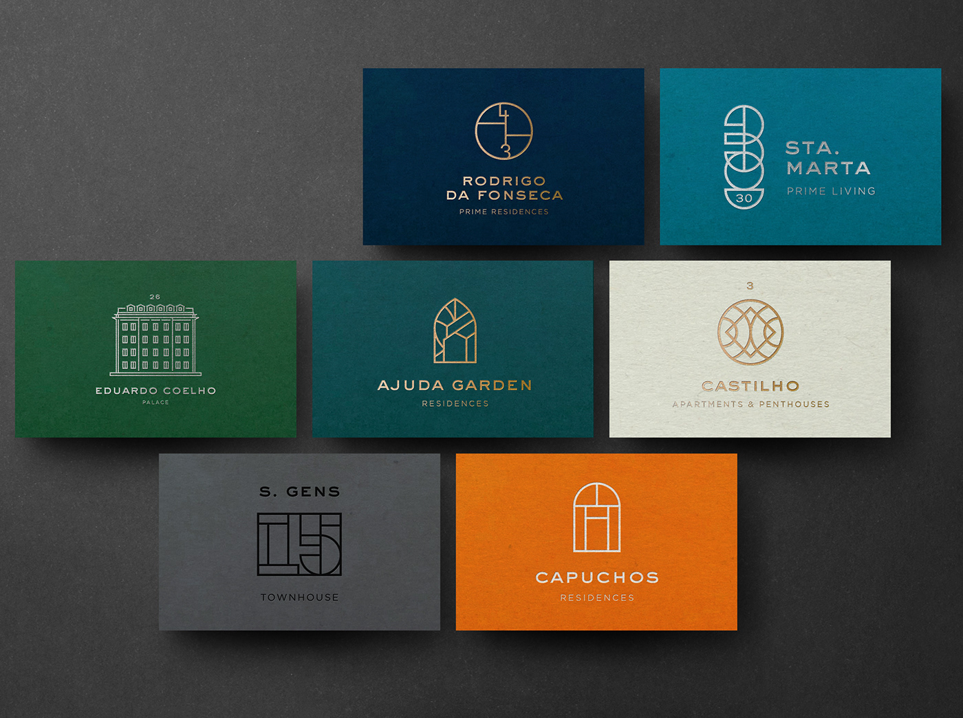
Every building is different, so I believe the branding should express that difference.
A nineteenth century rehabilitation in Graça and a new-build on the coast are not the same product. Different era, different street, different light, different materials, different life. The buyer for one is not the buyer for the other. One person is buying a historic address in the city. Another is buying the water and the view.
A single mark cannot say both of those things with conviction. It can only say the developer's name, and then let the building explain itself. That is a lot of weight to leave on the architecture alone.
So when a developer asks for my recommendation, I recommend a distinct brand for each project. The identity comes out of that specific building: what it is, where it stands, and who is going to live in it.
There is a version that takes both. The project carries its own name and identity and leads the communication, and the developer signs it, the way a producer signs a film. The buyer falls for the building. The signature tells them who stands behind it.
That is usually the answer for a developer with a real track record and a genuinely varied portfolio.
Print it at signage scale and hold it against a photograph of the actual façade. Look at it in one colour. Look at it small. Ask who it is speaking to, and be specific about that person.
If the answer is a real buyer with a real life, the mark is doing its job. If the answer is "premium buyers," you are looking at a decoration.
We build visual infrastructure for premium physical spaces. Based in Lisbon. Creating worldwide.
Send us a DM to start a collaboration.