Pages
Pages
Arrow Right Black
Arrow Right Black
Parklane logo on the residential building facade

Country:

Portugal, Lisbon

Year:

2026

Client:

Residential property Parklane

Service:

Visual identity

Country:

Portugal, Lisbon

Year:

2026

Type:

Residential property Parklane

Service:

Visual identity

About

Parklane is an exclusive residential building on Rua Castilho, Lisbon, developed by Noronha Sanches.
Apartments at the edge of Parque Eduardo VII, where a historic palace base meets a contemporary structure built to the same standard of precision.

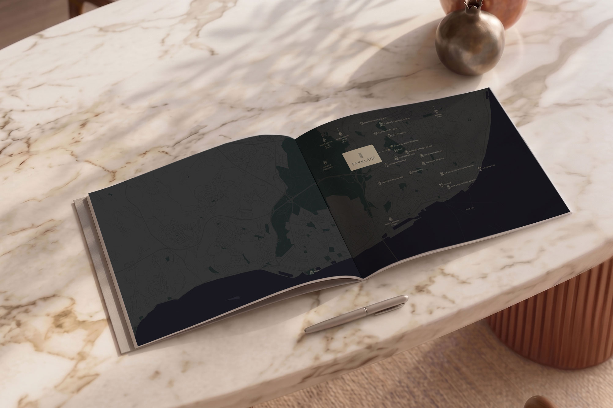
Parklane brochure page with location map
Parklane logo with the architectural symbol
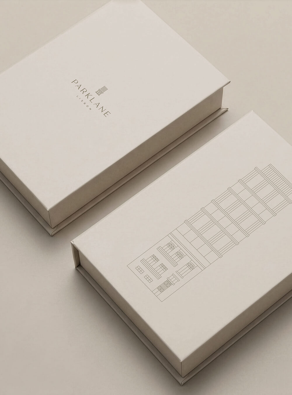
Parklane branded box

The challenge

The brief was to build a brand identity that held two architectural realities in the same frame without forcing them together.
The historic arched base and the clean vertical lines of the upper floors needed a visual language that felt neither nostalgic nor cold. The audience is high-net-worth buyers who read the details. A mark that didn't earn its authority on paper wouldn't survive on a marble facade.

Parklane A4 printed collateral
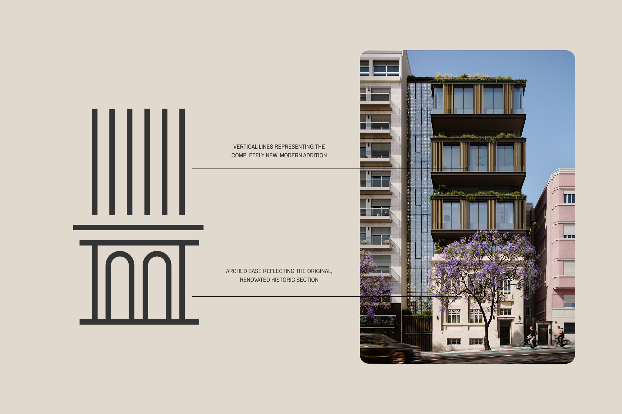
Parklane symbol explained: arched base and vertical upper floors

Deliveries

A complete identity system, from the mark to the material.
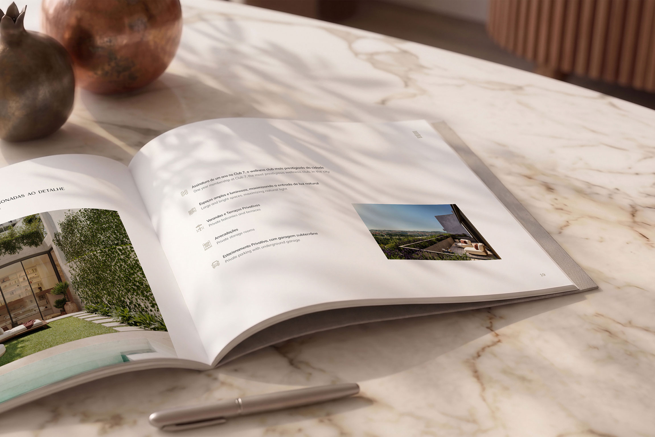
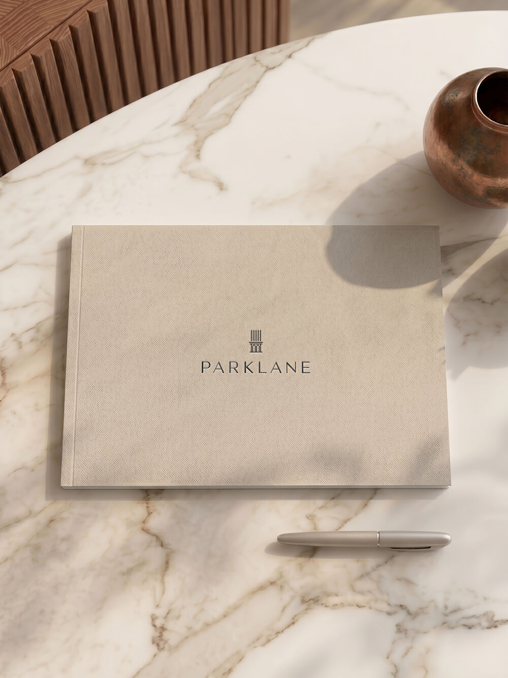
The core symbol draws directly from the building's structure: the vertical rhythm of the upper floors and the arched openings of the historic base, reduced to a single architectural icon. The logotype pairs it with a high-contrast serif, grounded and precise. The palette of soft cream, warm grey and metallic gold comes from the natural light inside the apartments and the finishes used throughout. Every touchpoint was built to match the physical weight of the building it represents.

Parklane brochure inside layout
Parklane colour palette of cream, warm grey and gold
Parklane brochure cover

Our work
Explore similar projects

Explore our latest collaborations with ambitious spaces and visionary founders.